A Shiny dashboard for visualizing Bike Share Toronto ride data
I have been a regular user of Bike Share Toronto for a number of years. Bike Share Toronto provides access to rental bikes located all around downtown Toronto. To use it, you simply pick up a bike at one station, and ride it to your destination. I originally used this service when it first launched in Montreal (called Bixi), and was glad to see it expand to Toronto, as well as other major cities around the world.
After logging in at more than 450 rides, I thought it would be cool to analyze and visualize the data. Around the time I started this project (2015), I also learned about Shiny to create interactive apps.
Although I started this side project in 2015, I only managed to write about it until now, four years later!
A demo of the app is available here and the source code is on GitHub.
Getting the trip data
For this post, I’m using simulated ride data that I generated using this R script. For real data, I manually copied and pasted my ride data from my account and saved it as a text file.
Analyzing ride data and visualizing using ggplot2
For visualization ride data, I used ggplot2. When I started this project I had
minimal experience using ggplot2, so it was a great exercise
to practice creating plots using this package.
To this day it is still my favourite package for creating high-quality
plots.
I came up with several different ways to visualizing the data, including:
- How many trips were taken per month?
- How long was each trip?
- When was each trip taken?
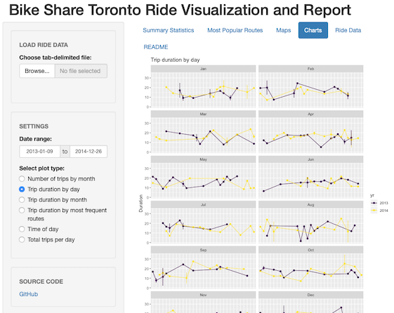
I learned a lot while coming up with ggplot solutions to each of those questions.
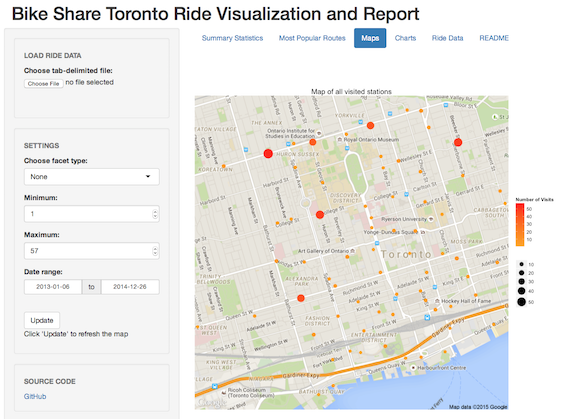
Visualizing station location usage
The ggmap is a great pakage for creating geographical maps via ggplot2. I used this package to visualize how often I visited each station.